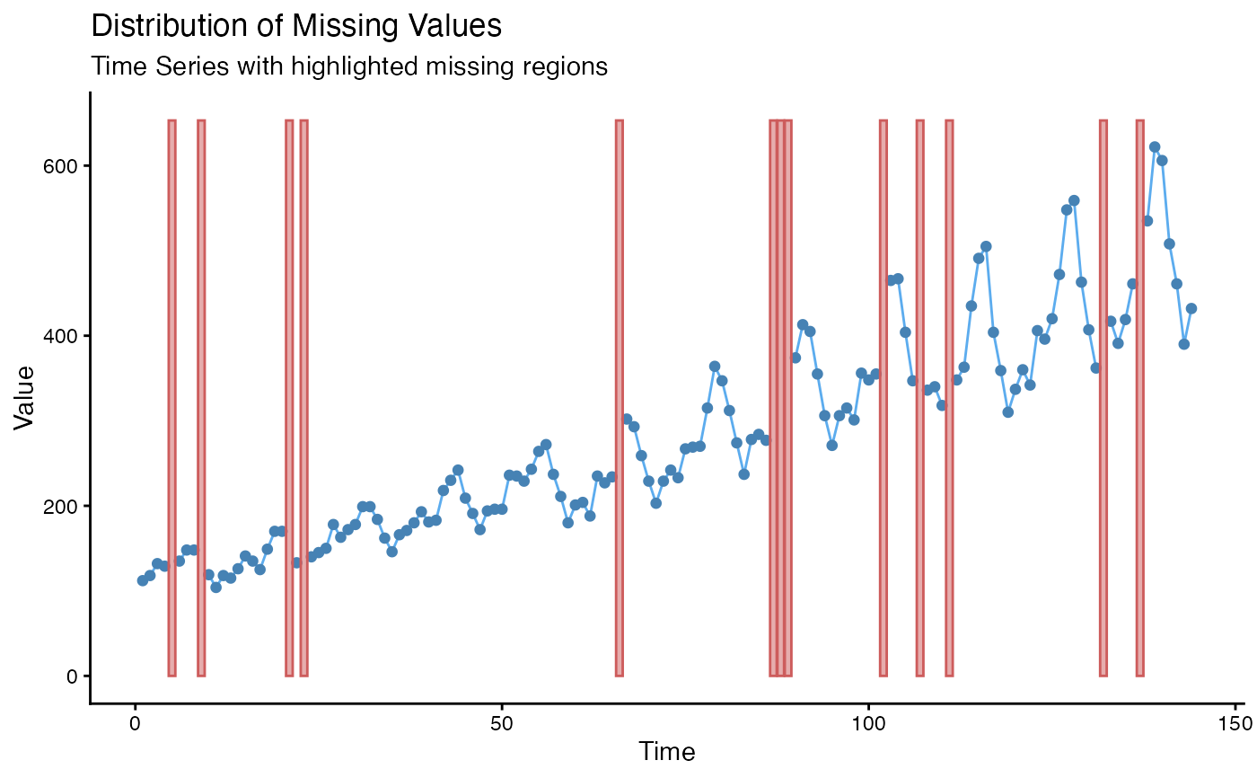
Line Plot to Visualize the Distribution of Missing Values
Source:R/ggplot_na_distribution.R
ggplot_na_distribution.RdVisualize the distribution of missing values within a time series.
ggplot_na_distribution(
  x,
  x_axis_labels = NULL,
  color_points = "steelblue",
  color_lines = "steelblue2",
  color_missing = "indianred",
  color_missing_border = "indianred",
  alpha_missing = 0.5,
  title = "Distribution of Missing Values",
  subtitle = "Time Series with highlighted missing regions",
  xlab = "Time",
  ylab = "Value",
  shape_points = 20,
  size_points = 2.5,
  theme = ggplot2::theme_linedraw()
)
Arguments
- x
Numeric Vector (
vector) or Time Series (ts) object containing NAs. This is the only mandatory parameter - all other parameters are only needed for adjusting the plot appearance.- x_axis_labels
For adding specific x-axis labels. Takes a vector of
DateorPOSIXctobjects as an input (needs the same length as x) . The Default (NULL) uses the observation numbers as x-axis tick labels.- color_points
Color for the Symbols/Points.
- color_lines
Color for the Lines.
- color_missing
Color used for highlighting the time spans with NA values.
- color_missing_border
Color used as border for time spans with NA values.
- alpha_missing
Alpha (transparency) value used for color_missing.
- title
Title of the Plot (NULL for deactivating title).
- subtitle
Subtitle of the Plot (NULL for deactivating subtitle).
- xlab
Label for x-Axis.
- ylab
Label for y-Axis.
- shape_points
Symbol to use for the Observations/Points. See https://ggplot2.tidyverse.org/articles/ggplot2-specs.html as reference.
- size_points
Size of Symbols/Points.
- theme
Set a Theme for ggplot2. Default is ggplot2::theme_linedraw(). (
theme_linedraw)
Details
This function visualizes the distribution of missing values within a time series. If a value is NA, the background is colored differently. This gives a good overview of where most missing values occur.
The only really needed parameter for this function is x (the univariate time series that shall be visualized). All other parameters are solely for altering the appearance of the plot.
As long as the input is univariate and numeric the function also takes data.frame, tibble, tsibble, zoo, xts as an input.
The plot can be adjusted to your needs via the function parameters. Additionally, for more complex adjustments, the output can also be adjusted via ggplot2 syntax. This is possible, since the output of the function is a ggplot2 object. Also take a look at the Examples to see how adjustments are made.
For very long time series it might happen, that the plot gets too crowded
and overplotting issues occur. In this case the
ggplot_na_distribution2 plotting function can provide
a more condensed overview.
Examples
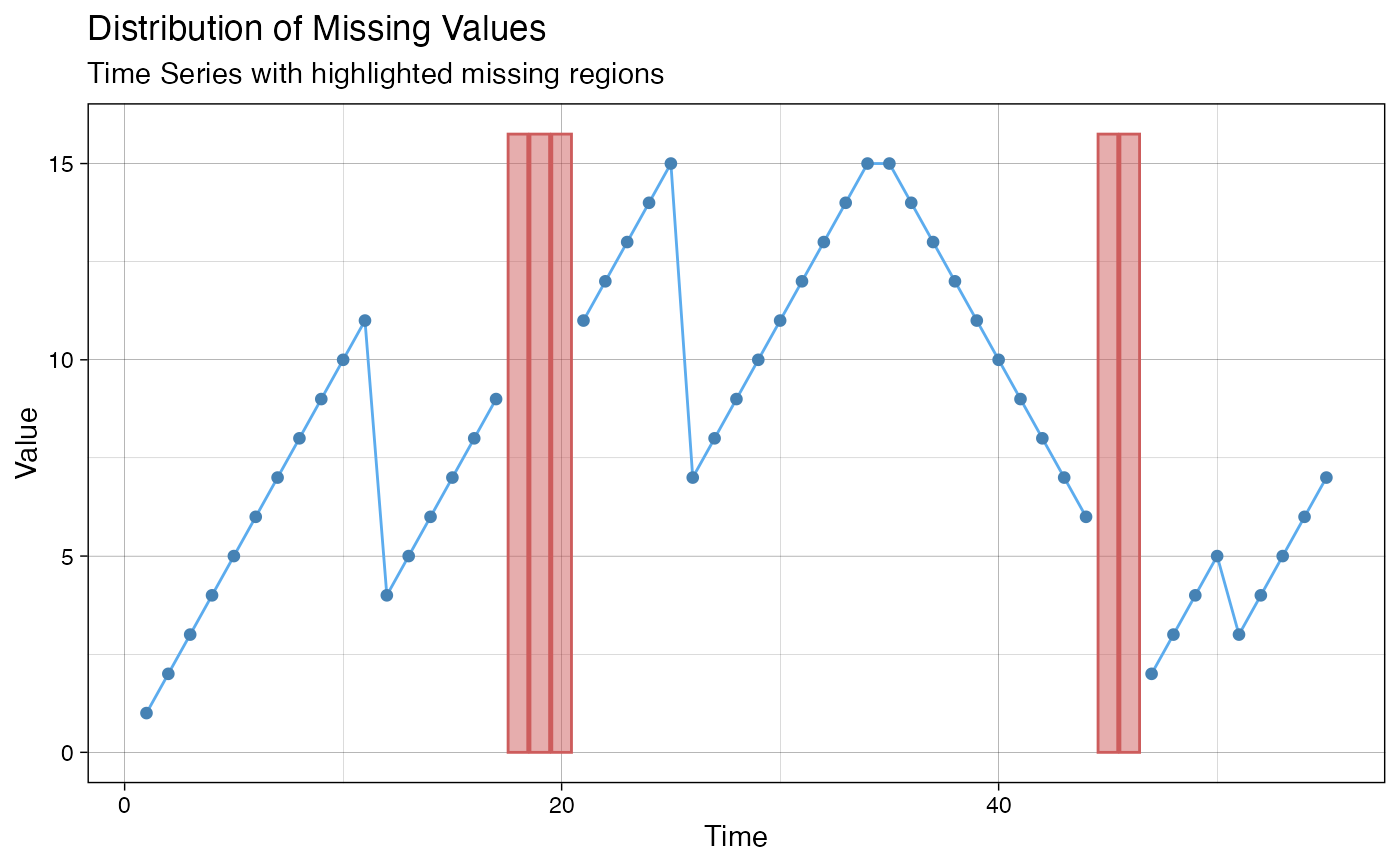
# Example 1: Visualize the missing values in x
x <- stats::ts(c(1:11, 4:9, NA, NA, NA, 11:15, 7:15, 15:6, NA, NA, 2:5, 3:7))
ggplot_na_distribution(x)
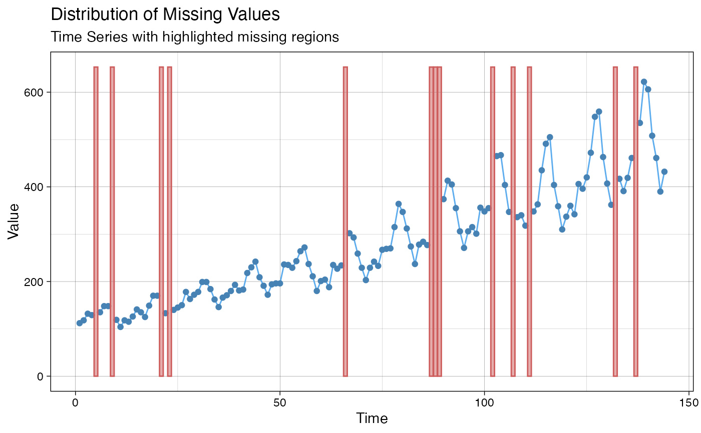
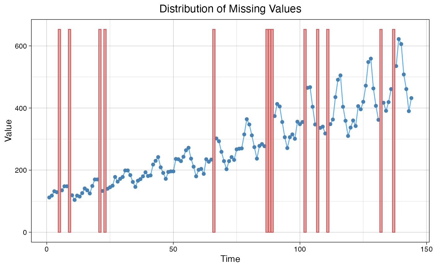
 # Example 2: Visualize the missing values in tsAirgap time series
ggplot_na_distribution(tsAirgap)
# Example 2: Visualize the missing values in tsAirgap time series
ggplot_na_distribution(tsAirgap)
 # Example 3: Same as example 1, just written with pipe operator
x <- ts(c(1:11, 4:9, NA, NA, NA, 11:15, 7:15, 15:6, NA, NA, 2:5, 3:7))
x %>% ggplot_na_distribution()
# Example 3: Same as example 1, just written with pipe operator
x <- ts(c(1:11, 4:9, NA, NA, NA, 11:15, 7:15, 15:6, NA, NA, 2:5, 3:7))
x %>% ggplot_na_distribution()
 # Example 4: Visualize NAs in tsAirgap - different color for points
# Plot adjustments via ggplot_na_distribution function parameters
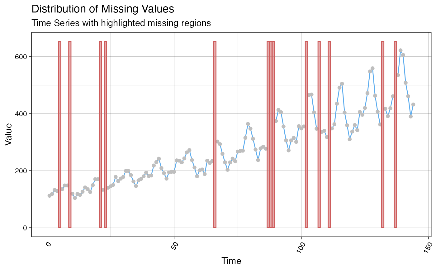
ggplot_na_distribution(tsAirgap, color_points = "grey")
# Example 4: Visualize NAs in tsAirgap - different color for points
# Plot adjustments via ggplot_na_distribution function parameters
ggplot_na_distribution(tsAirgap, color_points = "grey")
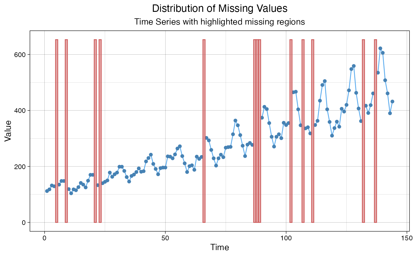
 # Example 5: Visualize NAs in tsAirgap - different theme
# Plot adjustments via ggplot_na_distribution function parameters
ggplot_na_distribution(tsAirgap, theme = ggplot2::theme_classic())
# Example 5: Visualize NAs in tsAirgap - different theme
# Plot adjustments via ggplot_na_distribution function parameters
ggplot_na_distribution(tsAirgap, theme = ggplot2::theme_classic())
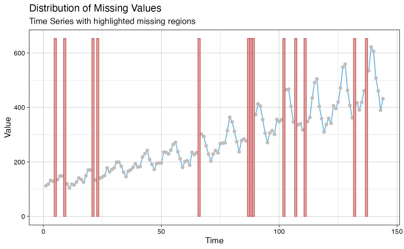
 # Example 6: Visualize NAs in tsAirgap - title, subtitle in center
# Plot adjustments via ggplot2 syntax
ggplot_na_distribution(tsAirgap) +
ggplot2::theme(plot.title = ggplot2::element_text(hjust = 0.5)) +
ggplot2::theme(plot.subtitle = ggplot2::element_text(hjust = 0.5))
# Example 6: Visualize NAs in tsAirgap - title, subtitle in center
# Plot adjustments via ggplot2 syntax
ggplot_na_distribution(tsAirgap) +
ggplot2::theme(plot.title = ggplot2::element_text(hjust = 0.5)) +
ggplot2::theme(plot.subtitle = ggplot2::element_text(hjust = 0.5))
 # Example 7: Visualize NAs in tsAirgap - title in center, no subtitle
# Plot adjustments via ggplot2 syntax and function parameters
ggplot_na_distribution(tsAirgap, subtitle = NULL) +
ggplot2::theme(plot.title = ggplot2::element_text(hjust = 0.5))
# Example 7: Visualize NAs in tsAirgap - title in center, no subtitle
# Plot adjustments via ggplot2 syntax and function parameters
ggplot_na_distribution(tsAirgap, subtitle = NULL) +
ggplot2::theme(plot.title = ggplot2::element_text(hjust = 0.5))
 # Example 8: Visualize NAs in tsAirgap - x-axis texts with angle
# Plot adjustments via ggplot2 syntax and function parameters
ggplot_na_distribution(tsAirgap, color_points = "grey") +
ggplot2::theme(axis.text.x = ggplot2::element_text(angle = 60, hjust = 1))
# Example 8: Visualize NAs in tsAirgap - x-axis texts with angle
# Plot adjustments via ggplot2 syntax and function parameters
ggplot_na_distribution(tsAirgap, color_points = "grey") +
ggplot2::theme(axis.text.x = ggplot2::element_text(angle = 60, hjust = 1))