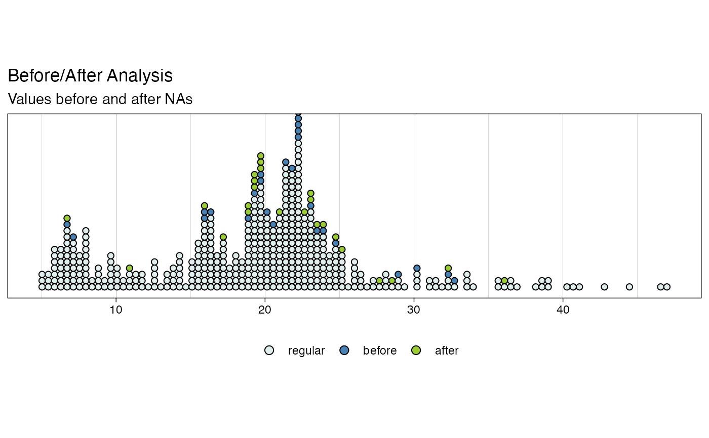
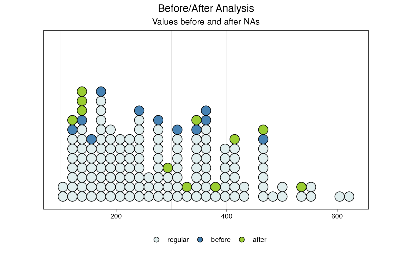
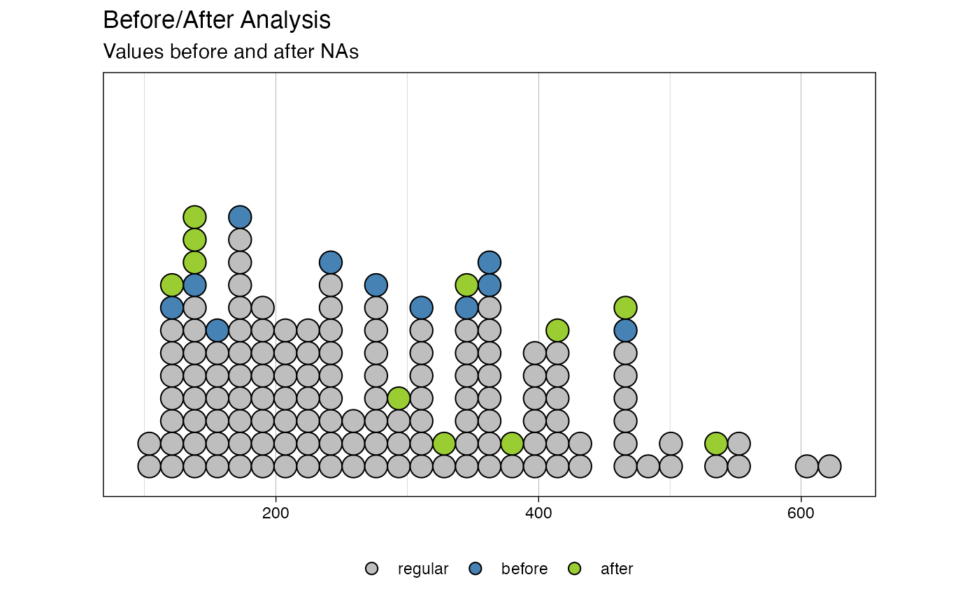
Dotplot of Value Distribution directly before/after NAs
Source:R/ggplot_na_level.R
ggplot_na_level.RdVisualize the distribution of values directly before/after NAs via a dotplot. Useful to determine if missing values appear more often when a certain threshold level is reached.
ggplot_na_level(
  x,
  number_bins = ifelse(length(x)/10 < 30, 30, length(x)/10),
  color_before = "steelblue",
  color_after = "yellowgreen",
  color_regular = "azure2",
  title = "Before/After Analysis",
  subtitle = "Values before and after NAs",
  xlab = NULL,
  ylab = NULL,
  legend = TRUE,
  legend_title = "",
  orientation = "vertical",
  label_before = "before",
  label_after = "after",
  label_regular = "regular",
  theme = ggplot2::theme_linedraw()
)
Arguments
| x | Numeric Vector ( |
|---|---|
| number_bins | Number of bins of stacked observations to be created. Default is length of time series divided by ten - but with a minimum of 30 bins. |
| color_before | Color for the dots representing observations directly before NA gaps. |
| color_after | Color for the dots representing observations directly after NA gaps. |
| color_regular | Color for the dots representing all values that are not next to NA observations. |
| title | Title of the plot (NULL for deactivating title). |
| subtitle | Subtitle of the plot (NULL for deactivating subtitle). |
| xlab | Label for x-Axis. |
| ylab | Label for y-Axis. |
| legend | If TRUE a legend is added at the bottom. |
| legend_title | Title for the legend. |
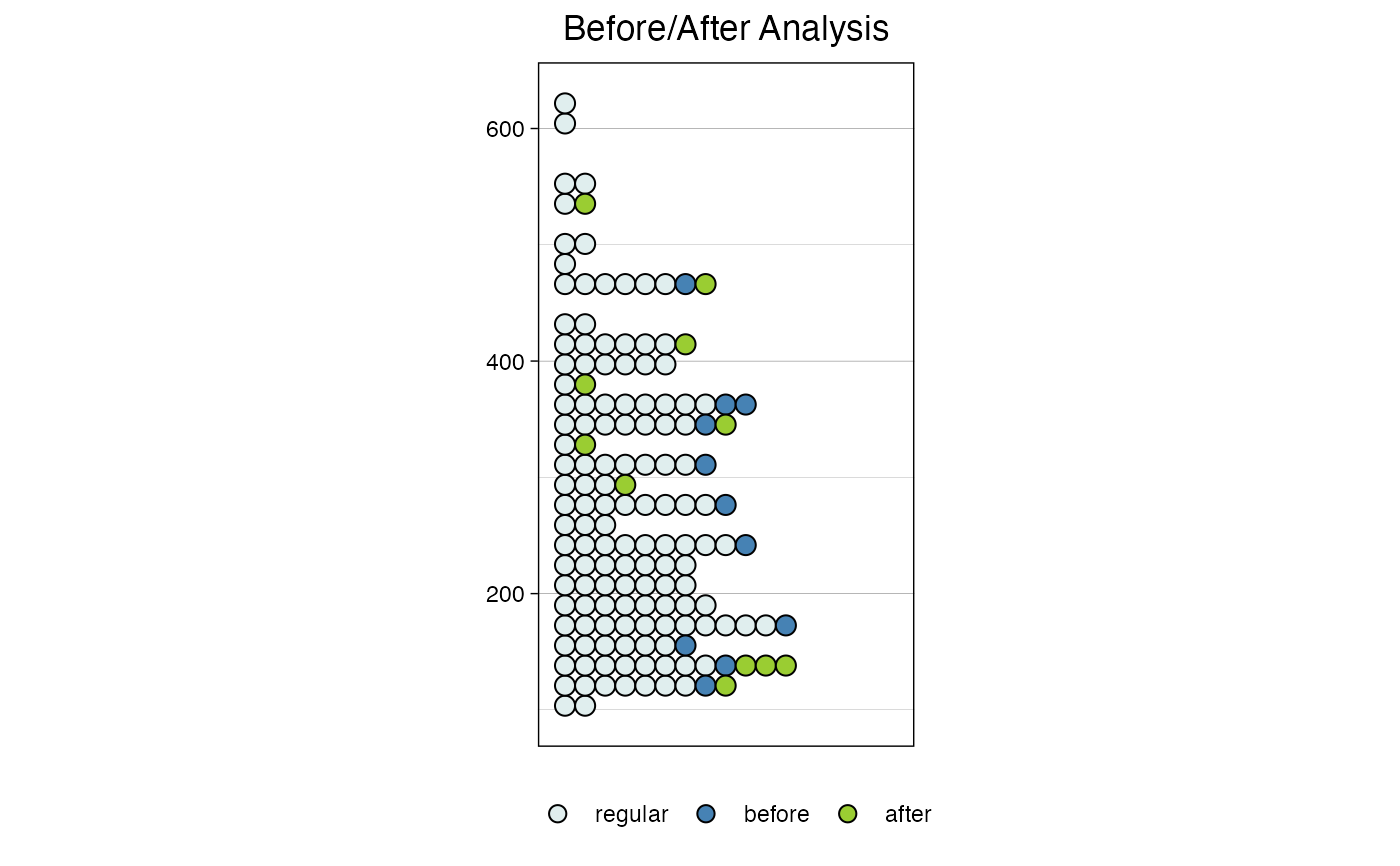
| orientation | Can be either 'vertical' or 'horizontal'. Defines if the plot is oriented vertically or horizontally. |
| label_before | Defines the legend label assigned to the observations directly before NAs. |
| label_after | Defines the legend label assigned to the observations directly after NAs. |
| label_regular | Defines the legend label assigned to the observations, that are not next to NA values. |
| theme | Set a Theme for ggplot2. Default is ggplot2::theme_linedraw().
( |
Details
This function visualizes the distribution of missing values directly before/after NAs via a dotplot. This is useful to determine if missing values appear more often when near to a certain value level.
In a geom_dotplot each dot represents one observation in the time series. It can be directly seen how many values are stacked into a bin (a value range).
The ggplot_na_level plot makes use of this and additionally colors observations before and after NAs differently.
The visualization of the before/after NA observations in a bin in comparison to the regular observations can provide information about the root cause of the missing values. It also can provide indications, about the missing data mechanism (MCAR, MAR, MNAR).
By looking at this plot it can be seen whether the NAs appear rather randomly after some values in the overall distribution or if e.g. it can be said NAs more likely appear after high values.
It could, for example be the case, that a sensor can't measure values above 100 degree and always outputs NA values once the temperature reaches 100 degree. With this plot, it can be realized, that NAs in the next value always occur when the temperature is close to 100 degree.
Thus, unusually high numbers of dots of before/after NA observations in a bin (in comparison the amount of dots of other observations in this bin) should draw the users' attention.
The advantage of the dotplot of ggplot_na_level over the violin plots of ggplot_na_level2 is that each observation in the time series is really displayed as a dot in the dotplot. For the user this can feel more intuitive. Especially, for very short time series the violins/boxplots and the summary statistics they provide are not so meaningful anymore. On the other hand, the ggplot_na_level is not a good choice for large time series. Drawing a visible dot for each observation comes to its limits, when the time series is larger than 500 observations. Also, while our assessment of distributions and anomalies usually works adequate on small amounts of data, we often struggle with large amounts of data. Here the violin/boxplot combination of ggplot_na_level2 is a great help.
The only really needed parameter for this function is x (the univariate time series that shall be visualized). All other parameters are solely for altering the appearance of the plot.
As long as the input is univariate and numeric, the function also takes data.frame, tibble, tsibble, zoo, xts as an input.
The plot can be adjusted to your needs via the function parameters. Additionally, for more complex adjustments, the output can also be adjusted via ggplot2 syntax. This is possible, since the output of the function is a ggplot2 object. Also take a look at the Examples to see how adjustments are made.
See also
ggplot_na_distribution2,
ggplot_na_gapsize,
ggplot_na_level2,
ggplot_na_distribution,
ggplot_na_imputations
Author
Steffen Moritz
Examples
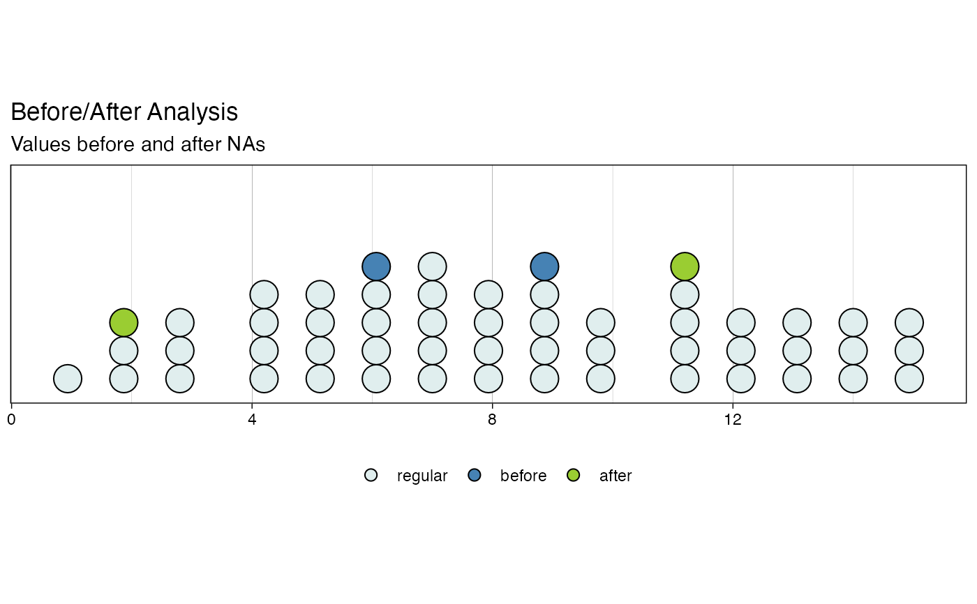
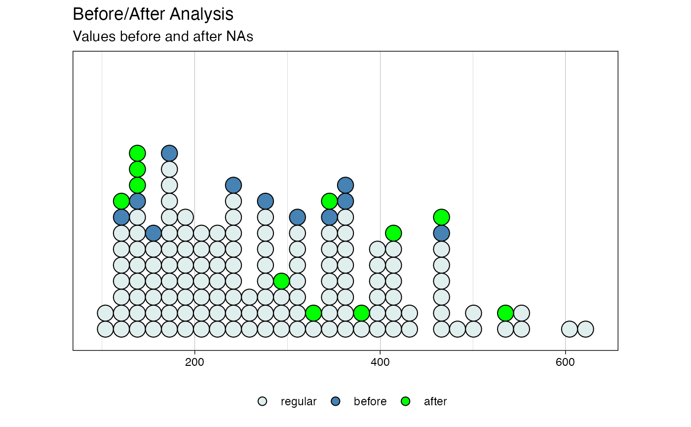
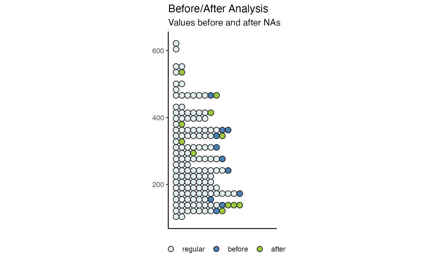
# Example 1: Visualize the before/after NA distributions x <- stats::ts(c(1:11, 4:9, NA, NA, NA, 11:15, 7:15, 15:6, NA, NA, 2:5, 3:7)) ggplot_na_level(x)# Example 2: Visualize the before/after in subset of tsNH4 time series, more bins ggplot_na_level(tsNH4[1:500], number_bins = 100)# Example 3: Same as example 1, just written with pipe operator x <- ts(c(1:11, 4:9, NA, NA, NA, 11:15, 7:15, 15:6, NA, NA, 2:5, 3:7)) x %>% ggplot_na_level()# Example 4: Visualize the before/after NA in tsAirgap - different color for violins # Plot adjustments via ggplot_na_level function parameters ggplot_na_level(tsAirgap, color_after = "green")# Example 5: Visualize before/after NA in tsAirgap - different theme and orientation # Plot adjustments via ggplot_na_level function parameters ggplot_na_level(tsAirgap, theme = ggplot2::theme_classic() , orientation = "horizontal")# Example 6: Visualize before/after NA in tsNH4 - title, subtitle in center # Plot adjustments via ggplot2 syntax ggplot_na_level(tsAirgap) + ggplot2::theme(plot.title = ggplot2::element_text(hjust = 0.5)) + ggplot2::theme(plot.subtitle = ggplot2::element_text(hjust = 0.5))# Example 7: Visualize before/after NA in tsAirgap - title in center, no subtitle # Plot adjustments via ggplot2 syntax and function parameters ggplot_na_level(tsAirgap, subtitle = NULL, orientation = "horizontal") + ggplot2::theme(plot.title = ggplot2::element_text(hjust = 0.5))# Example 8: Visualize before/after NA in tsAirgap - y-axis texts with angle # Plot adjustments via ggplot2 syntax and function parameters ggplot_na_level(tsAirgap, color_regular = "grey") + ggplot2::theme(axis.text.y = ggplot2::element_text(angle = 60, hjust = 1))